 Here you see y = sin x drawn with a thick
purple line and y = x2 - 3
drawn with a dotted thin green line.
Here you see y = sin x drawn with a thick
purple line and y = x2 - 3
drawn with a dotted thin green line. CalGraph allows different curves to look differently. Here's a sample
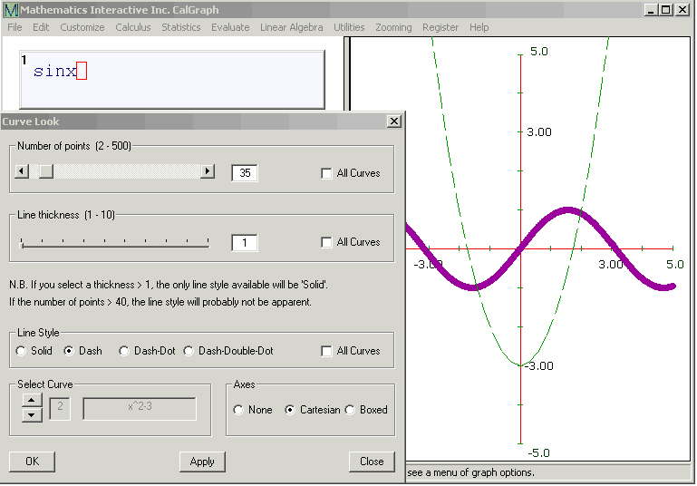
worked through. Here you see y = sin x drawn with a thick
purple line and y = x2 - 3
drawn with a dotted thin green line.
First I entered the curves, clicking sin x and then draw/cal, followed by next curve x ^2 - 3 and again draw/cal.
I clicked Customize on the top of the CalGraph window, and then Curve Look. There are three check boxes on the right of the Curve Look window, each is labelled All Curves. I clicked each one so there were no checks in the boxes.
Under where it says Select Curve, I clicked the down arrow so it said 1 in the first gray box and sin x in the second. This made sure I was working on the first curve y = sin x. I changed the Number of points to 500 and the Line thickness to 7.
Again I looked at Select Curve, this time clicking the up arrow so it said 2 in the first grey box and x^2-3 in the second. You can see it there. I changed the Number of points to 35. Under Line Style I clicked the white circle by Dash, so a dot appeared there. I clicked Apply and got what you see. Clicking on OK would close the Curve Look window.
It is also possible for the different curves to have different domains.