You may have done a survey asking personal information (perhaps weight) and ability (the time to do some task). Or perhaps you did some experiment and found the weight of something and the time it took to react. In any case, you have numbers in pairs, weight and time. There may be an obvious pattern linking them; if so, use it ... you don't need CalGraph. But if you suspect there is some sort of formula linking weight and time, but it is not obvious what the formula is, CalGraph can help.
Microsoft Excel is a commonly used program to store data, and many other programs allow you to output data as Excel data, so CalGraph works with Excel files. You can recognize them since their full filename ends with .xls. If you have a lot of data, you may want to copy just those numbers you are interested in to a new Excel file. That way you can work on them without damaging your hard-earned raw data.
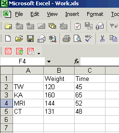
Calgraph likes the data to be in two columns next to each other, like this:
Fitting an Exponential Curve (Fitting a Polynomial Curve is further down this page.)
If you suspect your data have an exponential formula connecting them, something like y = AeBx , click Linear Algebra and then Exponential Curve Fitting at the top of the screen. You get a new window:
There's a lot going on in this window.
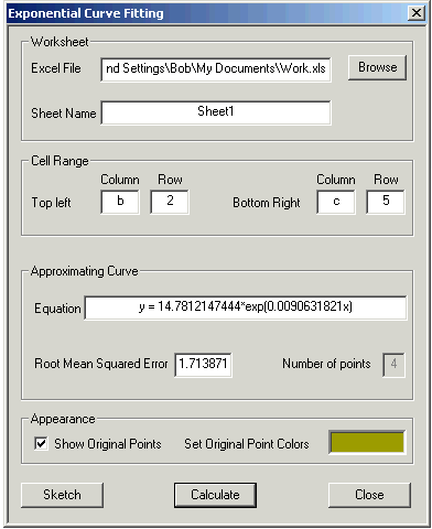
At the top, you tell CalGraph which Excel file you are using. Usually it is easiest to hit Browse and work your way to wherever you have put the Excel file. In my case the address for work.xls is so long you can't see all of it. Most often people have only one sheet in their Excel file, but if you have more than one, the Sheet Name box is where you tell CalGraph which sheet to work on.
Excel data is in little squares, called cells, arranged in Columns (called A, B, C and so on) and Rows (called 1, 2, 3, 4 and so on). In the first picture, the 120 is in cell B2.
CalGraph wants the data to be in two columns next to each other, making a rectangle. I wanted to use the data in the rectangle with 120 in one corner and 48 in the opposite corner, so I put B and 2 in the Top Left boxes.
I put C and 5 in the Bottom Right boxes since 48 is in cell C5.
Then I hit Calculate.
CalGraph calculated the Equation in the next box:
y = 14.7812147444*exp(0.0090631821x)
I did not want so many decimal places, so I wrote it in my notes as y = 14.781 e0.00906x
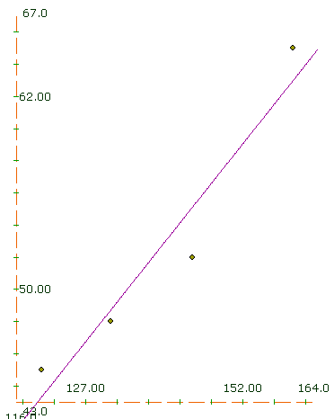
I wanted to see how well the formula fit the data so I clicked on Sketch. The result was this graph.
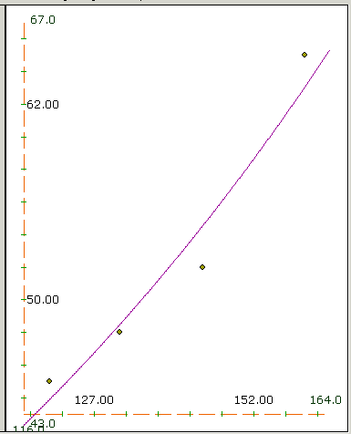
The purple curve is y = 14.781 e0.00906x and the green points are the data.
Use Customize to change the curve Domain and Range if you want.
If you want to try to fit another curve, click next curve first. Then both curves will show on the graph when you are done.
Root Mean Squared Error is a measure of how good a fit your line makes to the data. For each data point, CalGraph calculates the value of y from the equation. It subtracts this from the data's y-value and squares the difference. All these squares are added up and the sum is divided by the number of data. Finally CalGraph takes the square root.
If you are unhappy with the exponential formula, CalGraph can try a polynomial fit. The procedure is much the same. Click on Linear Algebra and then Polynomial Curve Fitting. This window opens:
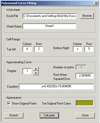
As before, you specify the Excel file and the Cell Range.
One new choice: you must indicate the Degree of the Approximating Curve.
Degree 1 is a straight line: y = Ax + B
Degree 2 is a parabola: y = Ax2 + Bx + C
Degree 3 is a cubic: y = Ax3 + Bx2 + Cx + D and so on.
The higher the degree you use, the lower your Root Mean Square Error. But higher degree may be harder to work with. So there's a trade off.
If you hit Sketch you get a graph of the curve and the data points.